How big is big?

chicken-and-eggI spent much of my day working on a case report I am doing with Dr Bob. It concerns a patient who died from overwhelming evolution. This is my first ever n=1 paper. That number is in shocking contrast to our recently accepted MDV paper, led by Dave, which involved 287 billion subjects. Is that a record in ecology and evolutionary biology?
Even if you work on the number of stars in the Milky Way, or the number of galaxies in the Universe, and however you define a billion, 287 billion is a very big number.

But when I Google ‘How big is 287 billion?’, I see it is in dollars what Republicans committed to add to the American deficit last year. So it must be a very small number, right?

Beautiful data (or why I’m learning Java Script)

How often do we look at our data and, wowed by its beauty, fail to translate beautiful results into an equally beautiful data visualization? In science, I think the answer is very often. Read any online journal article and you’ll stare at a static raster image, that looks about the same as if you were reading a paper copy, only on a screen. Static images, often pixelated under zoom, not interactive, not attractive.

Why can’t we have more data look like the data in Hans Rosling’s TED talk? Why can’t we make data like this? Or make data fun? And interactive?

We can, we just don’t. One alternative to static pictures summarizing our data (think of the bargraphs, boxplots and lineplots we see in most journals) is using something called D3 interactive data visualization. D3 stands for data driven documents and is a JavaScript library (d3.js) written by Mike Bostock. Bostock is largely known for his work at the New York Times as an editor for the graphics department doing cool stuff like this, and even cooler stuff in his free time.

My recent preoccupation with following the work of Bostock and reading Marcel‘s book, Nature, in Code, has made me wonder if and when we’ll start seeing better data visualizations in science. The technology to create interactive data visualizations is available, easy to learn and largely open source. I’m not a techie by any stretch of a stretchy imagination, and within a week I could learn the basics of JavaScript, get the d3.js library up and running and write my own programs to visualize life table data.

One benefit to using d3 in science is transparency. When the data is bound to the figure, any user can see where the patterns the figure is showing are coming from. Many journals are starting to require data to be placed in a data repository such as dryad, but what about the alternative: the data enters the manuscript directly through d3 figures? It seems bizarre that the current system of publishing does not emphasize, and rarely requires, publishing the raw data — isn’t that the most important part?

I’m hoping that the future of online journal articles veers away from looking like paper photocopies on a static screen. Imagine how much more fun reading online journal articles will be when we have dynamic documents that respond to user questions, allow us to look at subsets and explore data in different ways and at a faster pace than looking at a raster image generated from a dataset we can’t see. When will Nature and Science hire the Mike Bostock for our field?


When did we suspect that the Earth was round?

I recently read the passage:

“On the summit of the pillar, above one hundred and twenty feet from the ground, stood the colossal statue of Apollo. It was of bronze, had been transported either from Athens or from a town of Phrygia, and was supposed to be the work of Phidias. The artist had represented the god of day, or, as it was afterwards interpreted, the emperor Constantine himself, with a sceptre in his right hand, the globe of the world in his left, and a crown of rays glittering on his head.”

This caused me to pause and question my assumptions about how recently mankind had determined that the Earth was round.

I mentioned this to my mom. She immediately set me straight and sent me an essay by Isaac Asimov (earthpix). The essay is short, and well worth reading. As an extra incentive to read it …….. it explains how in 240 BC Eratosthenes used two sticks to correctly estimate the radius of the Earth.

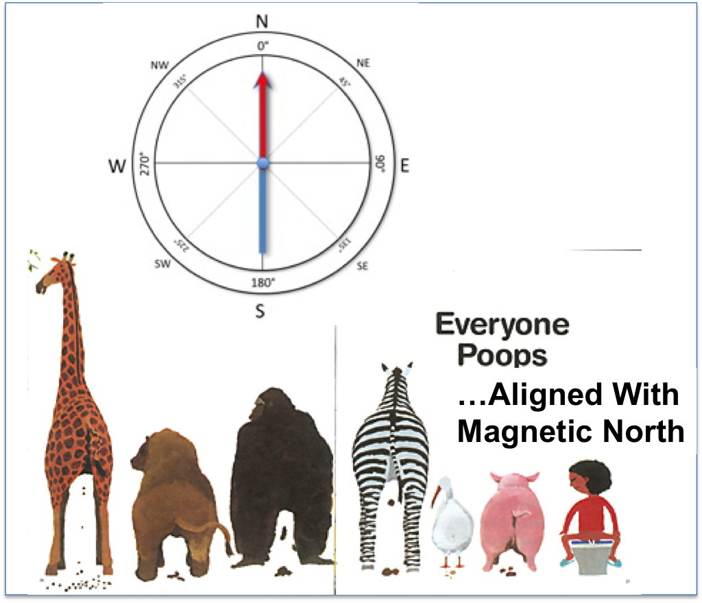
Is your toilet aligned North/South?

poops

I was curious about the article Jo mentioned at the pub about something I’m sure we’d all never thought about, but apparently are curious to find out.

Dogs do apparently poop facing magnetic north (or south, alining with the magnetic N/S axis). At the face (or butt?) of it, this kind of science seems frivolous, but the researchers did at least two things well:

1) made observations cheaply and came out with decent science

2) caught media/popular interest


JFK

Prompted by an excellent album by Public Service Broadcasting, I have been pondering a speech JFK gave on, coincidentally, the very day I was born. It was the speech that persuaded America to get into the Space Race (“We choose go to the moon in this decade, and do other things, not because they are easy, but because they are hard“). I’ve always admired how America rose to his challenge. That was the decade when Americans were sufficiently proud of American science and its potential to invest in it properly. Or sufficiently scared of the science of others.

But another part of the speech has me thinking.

“…we meet in an hour of change and challenge, in a decade of hope and fear, in an age of both knowledge and ignorance. The greater our knowledge increases, the greater our ignorance unfolds”.

Half a century later, nothing has changed. Maybe it never will.

Trade-offs we love (or look for)

Like most ecologists, I love talking about a good trade-off. Survival-reproduction, virulence-transmission, rate-efficiency, generalist-specialist. We’re not the only ones. Myrmecologists talk about their dominance-discovery, the physicists, about force-velocity (P=Fv), and consumers curse the trade-offs between cost and performance. The more we look for trade-offs the more we find — but why are we always looking?

A week ago I was sitting in Andrew’s office and we were talking about trade-offs like good biologists, when Andrew said something to me that I’ve been hoping was true for the good part of the last year: we shouldn’t always expect trade-offs. “Cars are expensive. Houses are expensive. We should see a trade-off between nice cars and expensive houses. But the fact is, we don’t.” We see the opposite: people with expensive cars, have expensive houses.  People with cheap cars, live in cheap apartments.

Trade-offs are trendy. In some cases, I think we look for trade-offs for good reason.  In others, I wonder if our focus on always looking for trade-offs has masked our abilities to see interesting counter-examples. Agonistic pleitropy (as opposed to antagonistic)? Synergies? Fast-and-efficient instead of fast-and-inefficient (rate-yield trade-off)?

Jeremy Fox wrote a recent blog for Oikos making a point for why trade-offs should be expected in ecology and evolution. Both Fox and Rowe (Rowe wrote this article that inspired Fox’s post), assumed that the two traits trying to be maximized are on opposing axes (one trait is on the x axis and one on the y axis) so if you randomly fired a shotgun at their graph of y vs. x, the closer the shot was to high x values, the further the shot would be from high y values. What confuses me is why we assume they are on opposing axes? Maybe two traits are two lines on top of each other (falling on the same axis) or are two squiggly lines that interlace and share peaks at some points, and have opposing peaks at other times.

Why do I think alternatives to the x and y axes ideas are possible? Because we see things like balancing selection (if a trade-off coming from one trait is frequency dependent maybe there are squiggles in our trait lines?), evolutionary spandrels (if there’s no mutational decay maybe maintenance costs don’t exist?), and “jack-masters” (what trade-off?).

Trade-offs everywhere and very little talk of alternatives makes me wonder if it’s nature or a human looking problem. I think I could be convinced of both but I’m reminded of something one of my favorite college professors used to say at the end of class: “The more we look, the more we find.” He would pause to put his notes down for a dramatic effect (which wore off by mid-April), and then we’d all look at the board and his wry smile. In my head he was saying: Hey, life is interesting. But remember this interesting life is subject to sampling bias.